Tuesday, December 13, 2016

Lab 8 Spectral Signature Analysis and Resource Monitoring

Nathan Sylte
Lab 8

Spectral Signature Analysis and Resource Monitoring

Goals and Background:

    One of the primary objectives for lab eight was to gain experience on the measurement and interpretation of spectral reflectance signatures of different surface materials. Another important objective of the lab was to perform resource monitoring of certain Earth resources. This was done by using remote sensing band/ratio techniques. 

    Other objectives for lab eight included the gathering of spectral signatures from remotely sensed images, graphing these signatures, and then analyze these signatures. This led into the analysis of the health of vegetation and soil of the surrounding region. 

Methods:

    Part one of the lab included spectral analysis. This was performed on twelve different materials and surfaces from an image of Eau Claire and the surrounding region. The spectral signatures analyzed from the Eau Claire area included the signatures of standing water, moving water, forest, riparian vegetation, crops, urban grass, dry soil, moist soil, rock, asphalt highway, airport runway, and a concrete surface. 

    The spectral analysis process began with the use of the polygon tool to digitize an area within the desired material or surface. Next, the supervised signature editor raster tool was used to analyze the signatures. The signature mean plot (SMP) was then displayed from the signatures. The plots for each of the signatures were displayed separate and all together. This same process was repeated for all twelve signatures.

    Part two of the lab involved two sections. Section one of the two sections involved the vegetation health monitoring of the Eau Claire area. This was done by using the normalized difference vegetation index (NDVI). The raster-unsupervised-NDVI tool was used perform the task. After the tool was ran, an equal interval map was generated in Arc Map showing the five different classes of vegetation abundance.

    Part two of the two sections included the soil health monitoring of the Eau Claire area. This was done by analyzing the ferrous mineral ratio of the soil in the area to look at the distribution of iron contents in the soil. The raster-unsupervised-indices tool was used to accomplish this task. After the model was run an equal interval map with five classes was generated in Arc Map showing the spatial distribution of ferrous minerals in the Eau Claire area.

Results:

    Results from part one of the lab are shown below.

Figure 1. Figure one (above) shows the signature mean plot (SMP) of the spectral signature of standing water. Reflectance is high in band 1 (blue band). 

Figure 2. Figure two (above) shows the SMP of the spectral signature of flowing water. Flowing water had a higher reflectance in band 4 (NIR) than standing water. 

Figure 3. Figure three (above) shows the SMP of the spectral signature of a forest. Forest reflects high in band 4 (NIR). 


Figure 4. Figure four (above) shows the SMP of the spectral signature of riparian vegetation. Riparian vegetation had high reflectance in band 4 (NIR). 

Figure 5. Figure five (above) displays the SMP of the spectral signature of crops. Crops had high reflectance in band 5 (MIR) indicating that the field they were planted in had high amounts of moisture. The crops were likely young which allowed this to show so predominantly. 

Figure 6. Figure six (above) shows the SMP of the spectral signature of urban grass. Urban grass had high reflectance in band 4 (NIR). 

Figure 7. Figure seven (above) represents the SMP of the spectral signatures of dry soil. Dry soil reflected high in band 3 (red). 

Figure 8. Figure eight (above) represents the SMP of wet soil. Wet soil had a high reflectance in band 5 (MIR) indicating a high moisture content. 

Figure 9. Figure nine (above) shows the SMP of rock. Rock had low reflectance in band 4 (NIR). 

Figure 10. Figure ten (above) shows the SMP of an asphalt highway. This asphalt highway is reflecting high in band 4 indicating there was some vegetation captured in the polygon. This means the highway had high amounts of vegetation growing around it. 

Figure 11. Figure eleven represents the SMP of an airport runway. This runway is reflecting high in band 3 (red). 

Figure 12. Figure twelve (above) shows the SMP of a concrete surface. This surface had high reflectance in band 3 (red). 

Figure 13. Figure thirteen (above) displays a comparison between wet and dry soil. Wet soil had higher reflectance in band 5 (MIR) indicating more moisture. 


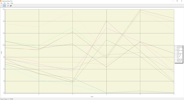
Figure 14. Figure fourteen (above) shows all of the SMPs on the same plot. 

    Below are the results from part two. 
Figure 15. Figure fifteen (above) represents an equal interval map of the vegetation in the Eau Claire region. Dark green represents areas with high amounts of vegetation. 

Figure 16. Figure sixteen (above) represents an equal interval map of the ferrous mineral content of the soil in the Eau Claire region. Areas that are darker in red have a higher ferrous mineral content. Areas that are dark green are mostly vegetation. 


Sources:

    Satellite image is from Earth Resources Observation and Science Center, United States Geological Survey. 

    United States Geological Survey. (2013). Home Page | Earth Resources Observation and Science (EROS) Center. Retrieved from http://eros.usgs.gov/


Tuesday, December 6, 2016

Lab 7 Photogrammetry

Nathan Sylte
Lab 7


Photogrammetry
 Goals and Background:

    Lab seven involved the development of photogrammetric skills. Specifically, we performed photogrammetric tasks on aerial photographs and satellite image. The overall goal of this lab was to gain the experience necessary to perform various photogrammetric tasks.

    There were three main parts to the lab. Part one will not be included in this lab report. However, part one of the lab involved calculating scale of nearly vertical aerial photographs. Part one also involved the measurement of areas of features on aerial photographs. Part two of the lab (stereoscopy) involved the generation of a three dimensional image using an elevation model. Lastly, part three of the lab included the use of Erdas Imagine Lecia Photogrammetric Suite (LPS) for the use of triangulation and orthorectification of images.

Methods:

    The stereoscopy (part two) portion of the lab was divided into two sections. Section one involved the creation of an anaglyph image with the use of a digital elevation model (DEM). This was done by using an image of the city of Eau Claire and a DEM of Eau Claire. The terrain-anaglyph tool was used to generate the anaglyph image. Section two of part two involved the creation of an anaglyph image with the use of a LiDAR derived surface model (DSM). This was done by using an image of Eau Claire and a DSM of Eau Claire. The same terrain-anaglyph tool was used.

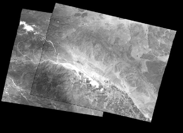
    The orthorectification (part three) portion of the lab was divided into six sections. Section one simply involved the creation of a new project using SPOT satellite images of Palm Springs, California. The toolbox-image photogrammetry tool was used to create a new project. The geometric model category for this project SPOT Pushbroom. The horizontal reference coordinate system parameters were as followed. The projection type was UTM, the spheroid name was Clarke 1866, the datum name was NAD27 (CONUS), and the UTM zone was 11.

    Section two of part three involved adding imagery to the block and define sensor model. First the panchromatic image was added to frame. The default parameters were accepted for the SPOT Pushbroom frame editor. Section three included the collection of ground control points (GCPs). The classic point measurement tool was used, and GCPs were collected with the help of a reference image which was displayed along side the panchromatic image. A total of 11 GCPs were collected. The last two GCPs were collected from a different horizontal reference source, and the Palm Springs DEM was selected as the vertical reference source.

    Section four of part three involved the collection of GCPs on the second image. First, a second panchromatic image was brought into the task manager, and default parameters were accepted. GCPs were collected on the new image that corresponded with the previous panchromatic image. This led into section five where tie points were collected automatically. The automatic tie point generation properties tool was used. The image used radio button was set to all available and the initial type radio button was set to exterior/header/GCP. Intended number of points/image was set to 40. After tie points were collected, triangulation was performed. The triangulation parameters were set in the following manner. Maximum normal interations was set to 5, interations with relaxation was set to 3, and the image coordinate units for report were set to pixels. The same weighted values were set to 15 for the x, y, and z options. Default settings were accepted for the rest and a triangulation summary report was generated. Finally, orthorectified images were generated. This was done by selecting the start ortho resampling process icon. DTM source was set to DEM, DEM file name was set to the Palms Springs DEM image, and the output cell sizes were set to 10. In the advanced settings the resampling method was set to bilinear interpolation. The second panchromatic image was then added and the model was run.

    Section six involved viewing the orthorectified image.

Results:

Below is the result from part two section one.

Figure 1. Figure one above shows the anaglyph from part two section one.

Below is the result from part two section two.

Figure 2. Figure two above shows the anaglyph from part two section two.

Below is my result from part three showing the orthorectified images.


Figure 3. Figure three above shows the orthorectified image from part three of the lab. The overlap of the area is spatially accurate.

Sources:


National Aerial Photography Program (NAPP) | The Long Term Archive. (2009). Retrieved from https://lta.cr.usgs.gov/NAPP

Thursday, November 17, 2016

Geometric Correction

Nathan Sylte
Lab 6


Geometric Correction

Goals and Background:  

    Lab six involved the introduction to geometric correction, which is extremely important in image processing. Specifically, lab six is designed to better ones abilities on image to map rectification, as well as image to image registration. Both of these processes are important in geometric correction and are often required to maximize data extraction from satellite images.

    There were two parts to lab six. Part one involved image to map rectification. In this case, a digital raster graphic (DRG) of the Chicago Metropolitan Area was used to correct a Landsat TM image of the same area. Part two involved image to image registration of an image of the Sierra Leone region.

Methods:

    To achieve the image correction of the Landsat TM image of Chicago, two images were brought into two separate viewers. The two images included the Landsat Chicago image as well as a reference image of the same area. The Landsat image served as the input image. The control points tool was selected and the polynomial geometric model was used. Specifically, the first order polynomial model was used. Four ground control points were then added to both the reference image and the input image with a control point error of less than two percent. The image below shows the ground control points used in part one of the lab.
 Figure 1. Figure one shows the Chicago Metropolitan Area, and the ground control point locations for part one of the lab. The image on the left of the frame is the reference image.

    Image correction of the Sierra Leone satellite image involved a similar process. The control points tool was used again; however, this time the third order polynomial model was used. Twelve control points were selected. For resample methods, the method was changed from nearest neighbor to bilinear interpolation. After the processes were complete, the new corrected images were compared to their reference images to look at spatial accuracy. The figure below shows the ground control points used in part two of the lab.
Figure 2. Figure two shows the Sierra Leone region, and the ground control point locations for part two of the lab The image on the left is the reference image.  

Results:

    Below is the result from part one.
Figure 3. Figure three shows the geometrically corrected image of the Chicago Metropolitan Area.

    Below is the result from part two.
Figure 4. Figure four shows the geometrically corrected image of the Sierra Leone region.

Sources: All images are from the Earth Resources Observation and Science Center, United States Geological Survey.
Geological Survey
.
Geological Survey
.

United States Geological Survey. (n.d.). Earth Resources Observation and Science Center. Retrieved from http://eros.usgs.gov/


Thursday, November 10, 2016

Lab 5 LiDAR Remote Sensing

Nathan Sylte
Lab 5

LiDAR Remote Sensing

Goals and Background:

    Lab five involved taking on the roll of a GIS manager where the goal was to work on a project for the City of Eau Claire, Wisconsin. Some important aspects of the project involved obtaining LiDAR point cloud information in LAS formation for the City of Eau Claire. Also, there was a quality check that occurred to ensure data quality.

    The overall objective of lab five was to become more knowledgeable about the structure and processing of LiDAR data. Specifically, lab five involved the processing and retrieval of surface and terrain models. Another important aspect of the lab was the processing and creation of intensity images and other results from point cloud.

    The lab was divided into three parts. Part one involved point cloud visualization in Erdas Imagine. Part two resulted in the generation of an LAS dataset, and part three involved the generation of LiDAR derivative products. 

Methods:

    Part one involved point cloud visualization in Erdas Imagine. Initially, the LiDAR point cloud files were saved in the (.las) format. This allowed them to be displayed in Erdas Imagine. ArcMap was then opened and a shape file of the AOI (area of interest) was added. The Erdas image was then compared with the ArcMap image.

    In part two, a new folder was created in arc catalog in which a new LAS dataset was to be stored. The LAS files where then converted into a LAS dataset. Statistics were also calculated for analysis purposes. Next, x, y, and z coordinate systems where assigned to the dataset. For the x and y coordinate system, the NAD 1983 HARN Wisconsin CRS Eau Claire (US Feet) coordinate system was used. For the z (vertical) coordinate system the NAVD 1988 system was used.

    Part three (generation of LiDAR derivative products) involved the LAS dataset to raster tool. This tool was used to generate a DSM (digital surface model) of Eau Claire that showed elevation. The parameters used are shown in figure one below. The hill shade 3D analyst tool was then used to enhance the image. The LAS dataset to raster tool was used again to generate a DTM (digital terrain model) of Eau Claire. However, different parameters were used. The cell assignment type was switched to Minimum. Last in section two of part three, a LiDAR intensity image was generated. The LAS dataset to raster tool was used again. The changed parameters included the value field reading INTENSITY, and the binning cell assignment type was changed to Average.


Figure 1. Shows the parameters used for the digital surface model.


Results:


Figure 2. Figure two shows the digital surface model from part three with the hill shade tool applied.


Figure 3. Figure three shows the digital terrain model from part three with the hill shade tool applied. Many surface features have been removed for analysis of terrain features.  


Figure 4. Figure four shows the intensity image displayed in Erdas Imagine for better viewing purposes.

Sources:

Eau Claire County. (2013). Lidar point cloud and Tile Index.


Tuesday, November 1, 2016

Nathan Sylte
Lab 4 Miscellaneous Image Functions


Goals and Background:

    There were a multitude of goals for the miscellaneous image functions lab. First, we delineated a study area from a large satellite image. Second, we showed how the spatial resolution of images can be maximized for specific visual interpretation. Third, we used radiometric enhancement methods in certain optical images. Our fourth goal was to link a satellite image to Google Earth, which can be used as supporting visual information. For our fifth goal, we were exposed to different methods in satellite image resampling. This led into the sixth goal of the lab which was the introduction to image mosaicking. Our last goal, which was goal seven, was to use binary change detection by using graphical models to analyze land change.

     Overall, lab four exposed us image preprocessing, image enhancement, delineation of study areas, image mosaicking, and the use of graphical modeling to analyze land change over time.

Methods:

    Part one resulted in the sub setting of an image in which we created an AOI (area of interest). This was done by first bringing the desired image into ERDAS IMAGINE. The raster tab was then clicked on followed by the opening of an inquire box. An inquire box was then opened around the Eau Claire region. Next, we used the subset and chip function followed by the create image subset option to create our sub image.

    Part two involved the pan sharpening of an image with poor resolution to visually maximize the image. First, the desired images were imported into ERDAS IMAGINE. Then the pan sharpen tool was used along with the resolution merge option to merge the images. The multiplicative pan sharpening method was used along with the nearest neighbor resample technique to generate the pan sharpened image.

    Part three ended in the reduction of haze from an image. The raster processing tool called radiometric with the haze reduction option was used to eliminate haze from our desired image. This proved to be a quick process resulting in a more clear image.

    In part four we linked our image viewer to Google Earth. First, we brought in an image of Eau Claire that was to be linked to the Google Earth View for visual aid. We simply clicked on the Google Earth tab and then used the connect to Google Earth option. The link Google Earth to view option was then activated to match the views. Next, we used the sync Google Earth to view option to sync the views.

    Part five resulted in the changing of image pixel sizes (resampling). The spatial raster tool along with the resample pixel size option were used first to resample the image. Nearest neighbor was the method of choice, and the output cell size was changed from 30 by 30 meters to 15 by 15 meters. The resample method was then changed to bilinear interpolation and the process was repeated.

    Image mosaicking was the focus of part six. First, the image was selected that was going to be added. However, the image was not immediately added to the viewer. The multiple tab was selected first and the radio button multiple images in virtual mosaic button was then chosen. The raster options tab was then selected followed by the checking of the background transparent and fit to frame boxes. The image was then added to the viewer, and the process was repeated for the second image that was to be mosaicked. Next, the mosaic express tool was used to mosaic the images. Section two of part six focused on the use of mosaic pro. The process started by bringing in the images in the same previous manner. The mosaic pro tool was selected and the selection of the add images option followed. The image area options tab was then selected along with the compute active area button. This process was repeated for both the images that were to be mosaicked. After these steps were completed, the send selected images button was chosen to order the images. The color corrections option was also used to achieve the desired image. The mosaic was then run.

    Part seven involved the use of binary change detection to analyze changes between two images. This involved the use of the raster functions tool. The two image functions option was utilized. The new image was then brought into a viewer for analysis. The histogram of the image was used to look for changes. The change and non-change areas on the histogram were calculated in the following manner. The upper limit was calculated by taking the mean + (1.5)standard deviation and adding it to the middle value of the histogram. The lower limit was calculated by subtracting the mean + (1.5)standard deviation from the middle value. Section two involved the mapping of change pixels with the use of spatial modeler. The equation deltaBV= BV(1)-BV(2)+c was used help calculate an input value for the model. Model maker was used to generate models for part seven.

Below are the models used in the analysis in part seven.


After running the models, a new image showing land change was generated. ArcMap was used to generate a map using that image to show land change around the Eau Claire region from 1991 to 2011.


Results:


Part 1 Section 1.


(Figure 1.) Part one section one result showing the Eau Claire area. The Eau Claire area is our area of interest.


Part 1 Section 2.


(Figure 2.) Part one section two result showing the sub setting with the use of an area of interest shape file.


Part 2.


(Figure 3.) Result from part two showing the pan sharpened image of the Eau Claire area.


Part 3.


(Figure 4.) Result from part three showing the haze reduced image of the Eau Claire area.


Part 4.


There is no result from part four. We simply used Google Earth as an auxiliary view of the Eau Claire area. This result can be achieved by following the instructions from the methods section (part 4).


Part 5.


(Figure 5.) Result from part five showing the resampled images. On the left is the image resampled using bilinear interpolation. On the right is the image resampled using the nearest neighbor method.


Part 6 Section 1.


(Figure 6.) Result from part six showing the image generated using mosaic express (right), compared to the original image (left).


Part 6 Section 2.


(Figure 7.) Result from part six showing the image generated by using mosaic pro (right) compared to mosaic express (left).

Part 7 Section 1.


(Figure 8.) Result from part seven section one showing the histogram generated. YY represents the upper limit and -XX represents the lower limit. Upper and lower limit values are written in blue. Yellow highlighted areas show change areas.


Part 7 Section 2.
(Figure 9.) Result from part seven section two showing the area of change from 1991 to 2011 in the Eau Claire area. Areas that changed are shown in red while areas that didn't change area shown in grey.


Sources:


Satellite images are from Earth Resources Observation and Science Center, United States Geological Survey.


This is the link to lab four Link to Lab 4